The situation
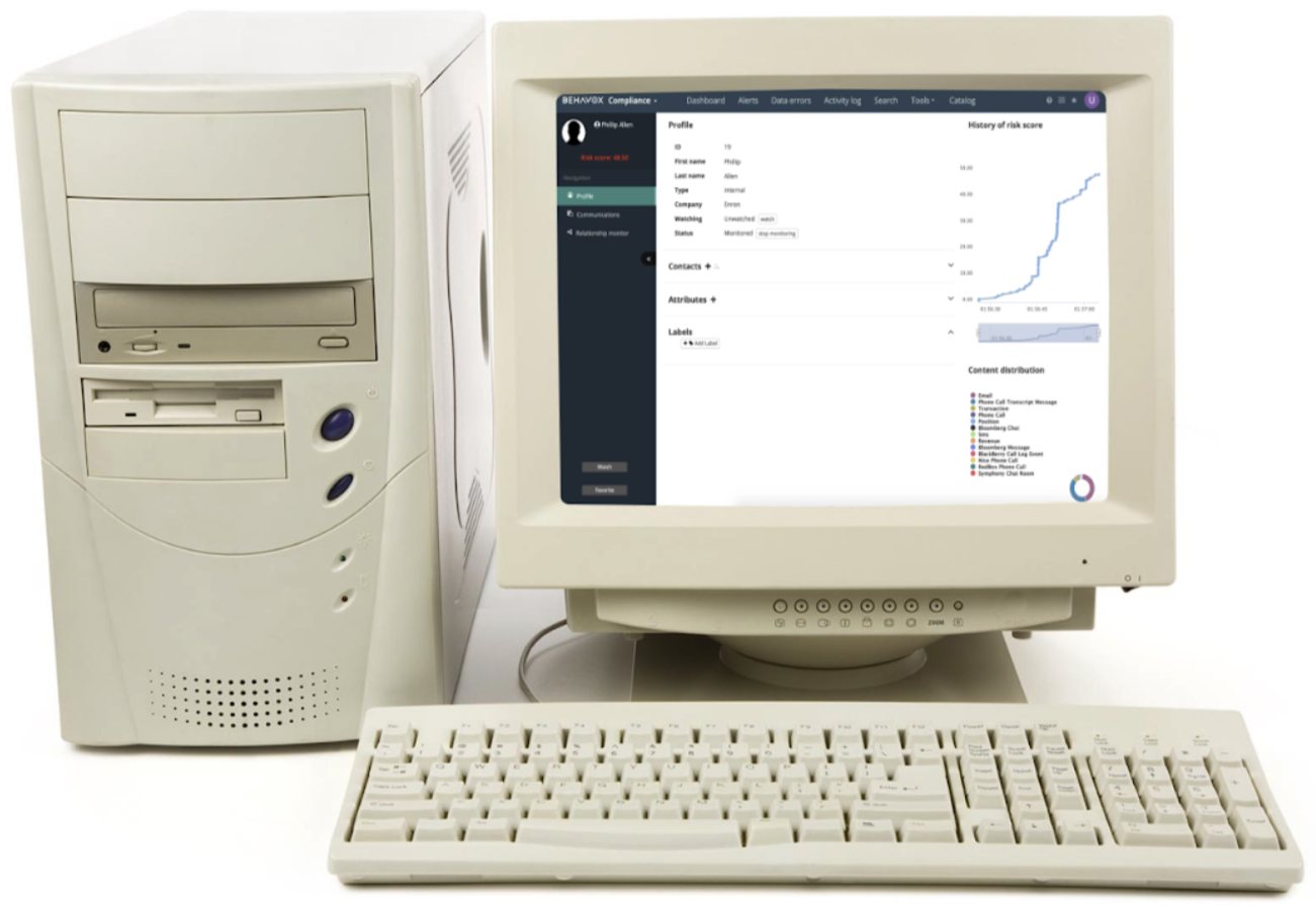
Behavox had no design practice until the design team was founded in 2020. The visual language had grown as features were added, which is to say it had grown in every direction at once. By the time I arrived the platform carried three problems at the same time:
- A look and feel disconnected from the brand. Marketing promised one thing, the product delivered another.
- Years of accumulated UX debt. Our heuristic evaluation documented 112 usability issues.
- No shared language with engineering. Different naming conventions on each side and collaboration that happened only when something broke.
Two months to design and build it, and a team of two: me and one front-end developer. So the plan was to dream big and act small.
Goals
- Align the visual language with the brand.
- Build the most frequently used components and make them accessible.
- Fix every usability issue that could be fixed without backend work, since there was no backend developer on the project.
- Build trust between design and engineering, which was the real long-term deliverable.
Bringing order first
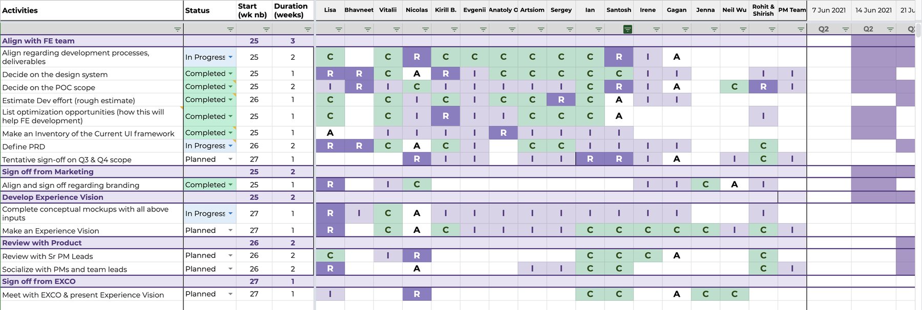
Before any pixels I wrote a RACI roadmap naming who was responsible, who was accountable, and who needed to be consulted or informed. Once the CPO and the design director signed it, the work had a mandate rather than being one designer's side project.
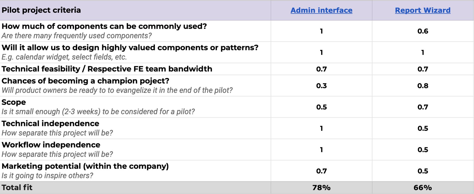
Choosing a pilot. A small pilot lets you make your first mistakes cheaply and win over the people who doubt the whole idea. I scored the candidates against Dan Mall's seven criteria, filled in together with the dev team. The admin interface won clearly.
Process
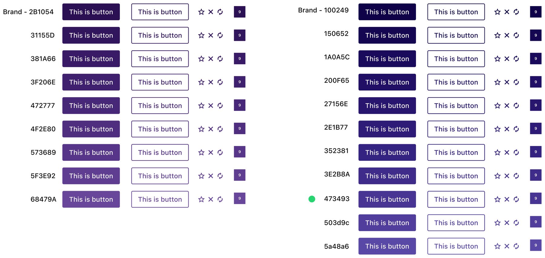
Colour. The legacy palette had drifted to almost a hundred colours, many of them indistinguishable. I started from the brand, but the original brand purples were far too dark for interface use, so with marketing's blessing I went looking for a digital version of the brand colour. I built shade ramps with ColorBox for the two brand hues, plus a dark grey carrying a hint of blue for neutrals, because pure greys made everything look like a wireframe.
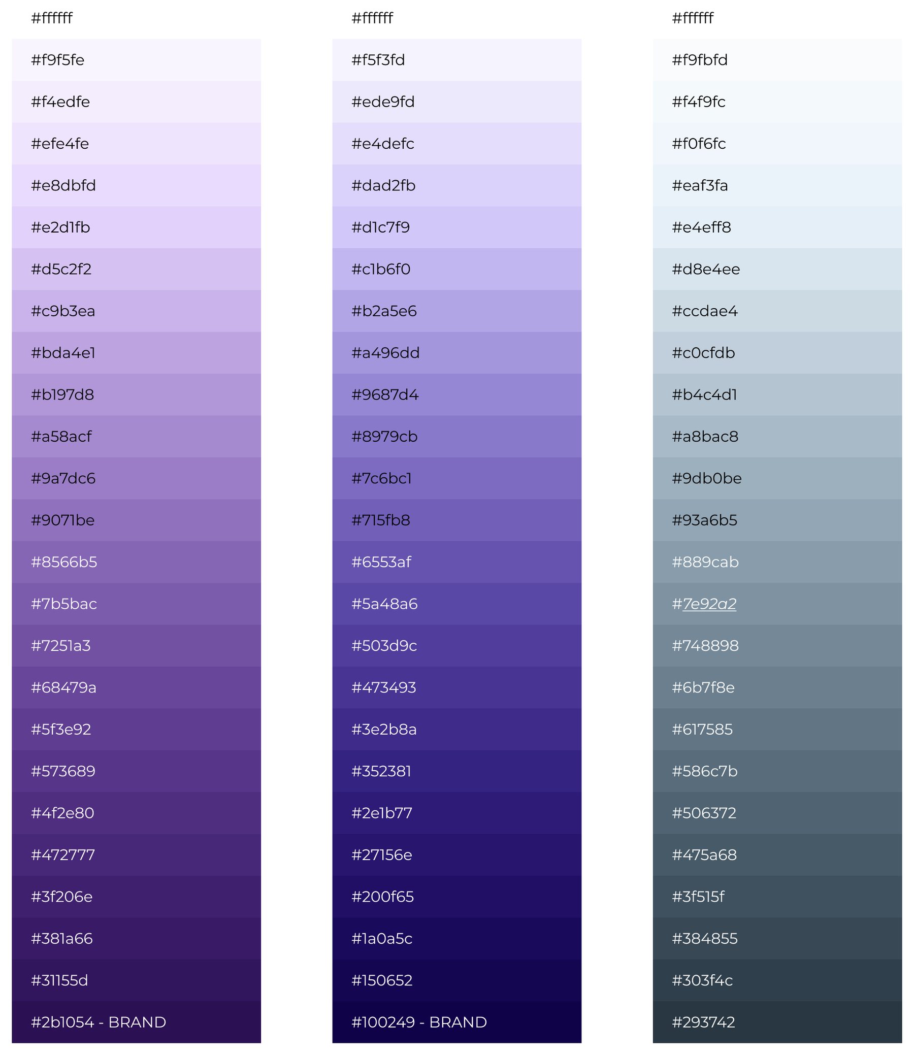
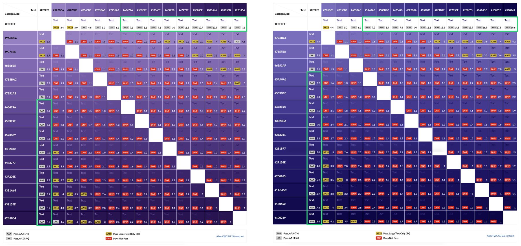
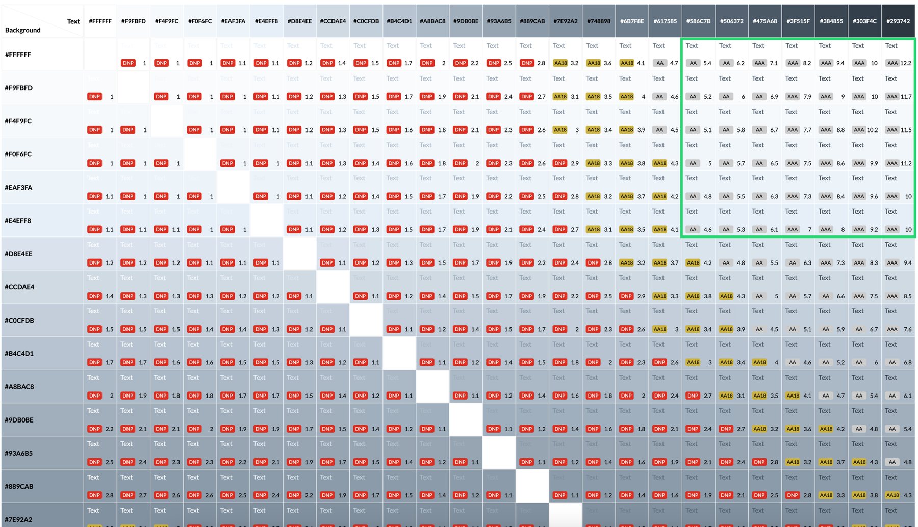
Then I checked the ramps for WCAG 2.0 compliance, agreed with marketing on which shade would act as the digital brand colour, and settled on #473493. For the neutrals I used Eight Shapes' Contrast Grid to test every foreground and background combination against minimum contrast, and picked the values for text, borders and disabled states from what passed. Same method again for reds, oranges, greens and blues covering errors, warnings, success, notifications and links.
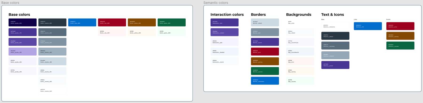
Naming, and a lesson learned. My first idea was abstract colour names, "Madrid" rather than "Darkest_Blue", on the theory that abstraction stays flexible. In practice it disconnected the palette from the way I think about colour, which is by hue, and choosing a shade became guesswork.
We switched to two connected palettes instead. A base palette naming colours by hue and shade, blue_700 and so on, where a higher number is darker. And a semantic palette naming them by function, border_default or text_secondary, referencing the base. It matched how designers actually reach for colour and stayed flexible for whatever came next.

Typography, elevation and icons. There was no type scale and no elevation system, just a handful of sizes people applied from memory. I built the minimum I knew I would use every day, with naming that left room to grow, and lifted the icons out of the legacy file into their own library.

Structuring the component library. Atomic or not? The atomic structure in the legacy library made things genuinely hard to find, because deciding whether something is a molecule or an atom is a debate, not a lookup. I interviewed my teammates and we chose unanimously what most public design systems do: a flat list with one page per interface element. Calendar, filtering panel, modal.
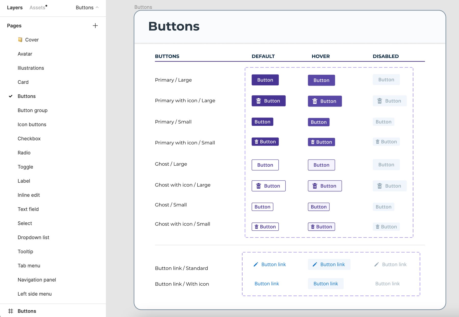
Building it, and redesigning the admin interface. With the foundations in place I screenshotted every admin page and built exactly the components those screens needed. The scope did not allow changing flows, only the visual layer, but even inside that constraint the interface got noticeably cleaner and lighter, and layout problems like sprawling multi-column forms went away.

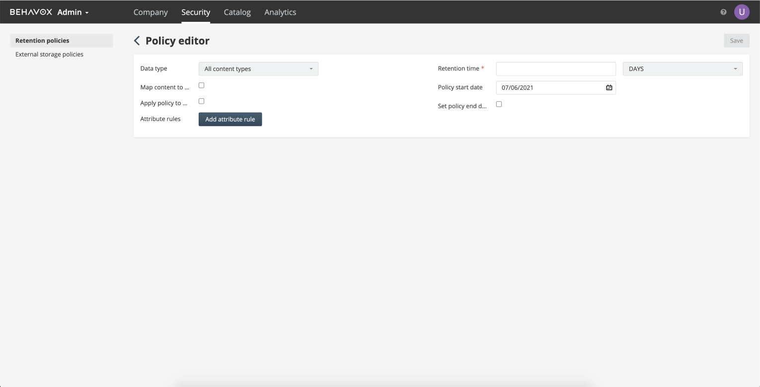
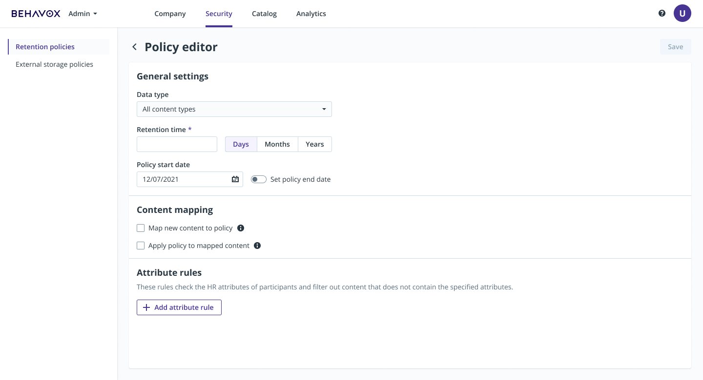
The front-end developer started implementing as soon as the first section was done. We aligned every morning at standup, which is how the trust goal got met without anyone working on it directly.
Results
- All foundational libraries and every admin screen delivered in three weeks.
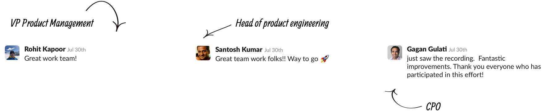
- Two months after kickoff I presented the new admin interface to the CPO, the head of product engineering, PMs and QA engineers.
- Green light to continue with the next section of the platform and to keep evolving the design system.
- A working relationship between design and engineering, including shared naming conventions, which had not existed before.